Design case study
Designing the VenueDeck self-checkout
The brief: a self-checkout any small venue can run. No POS required, no enterprise contract, no engineer on site. This is how the kiosk was designed, what the research changed, and why each screen looks the way it does.
VenueDeck design team · Spring 2026 · Self-checkout kiosk
The problem
Queues are staffed by your most expensive person
At a fast-casual counter, the till is a bottleneck with a wage attached. One person takes orders, answers questions, handles payment and apologises to the queue, all at once. Every minute they spend keying in a burger is a minute not spent making one.
Self-checkout fixed this for the big chains years ago, but the hardware and software those kiosks run on is priced and integrated for enterprises: bespoke installs, long contracts, and a POS estate to match. A cafe with six tables or an independent shop was priced out of the entire category.
So the brief was deliberately blunt: a customer walks up to a screen, orders, pays and collects, with no staff involvement, on hardware a small venue can actually buy. It had to work three ways: synced live with the venue’s till, from an imported CSV catalogue, or fully standalone with no POS at all.
What we investigated
We let five simulated customers break the first design
Before any build, the whole customer journey was written down as a workflow document: every screen, every state, every failure. Then we stress-tested it adversarially. Five reviewers each walked the documented flow as a different customer: a takeaway happy path, an eat-in order, a payment failure, an edge-case chaos run, and an independent red-team pass looking for contradictions between documents.
The review surfaced 4 critical, 9 high and 12 medium findings, and three reviewers converged independently on the same root defect: the first design captured payment before the order was authoritatively validated. Sold-out items, price drift and a dropped till connection were all checked after the card was charged, which made "charged with no food" a structural outcome rather than an edge case. The pipeline was redesigned around a simple rule: the order must exist before any money moves.
The same review reshaped smaller things you can see in the final screens: the chosen service mode is always visible, totals say what VAT they include instead of implying a surcharge, the checkout button stopped pretending to be the payment, and a sold-out item removes itself from the order honestly instead of failing the whole basket. Honest findings make better screens than taste does.
Decision 01
The idle screen is a salesperson, not a screensaver
A kiosk spends most of its day waiting. We made the idle screen an attract loop: four to six appetising product photos crossfading behind the venue’s brand mark and a single instruction. Industry evidence consistently points the same way: food photography sells, motion draws the eye from across a room, and kiosks lift average order value.
The execution rules matter more than the idea. A fixed gradient veil sits over the imagery and the brand mark gets a frosted backing plate, so the call to action holds WCAG AA contrast on every slide rather than gambling on the photo behind it. The first touch goes straight into ordering. Reduced-motion preferences drop the slideshow to a calm still, and venues without enough photos fall back to a hero image or a plain brand mark, so the screen is never broken or empty.
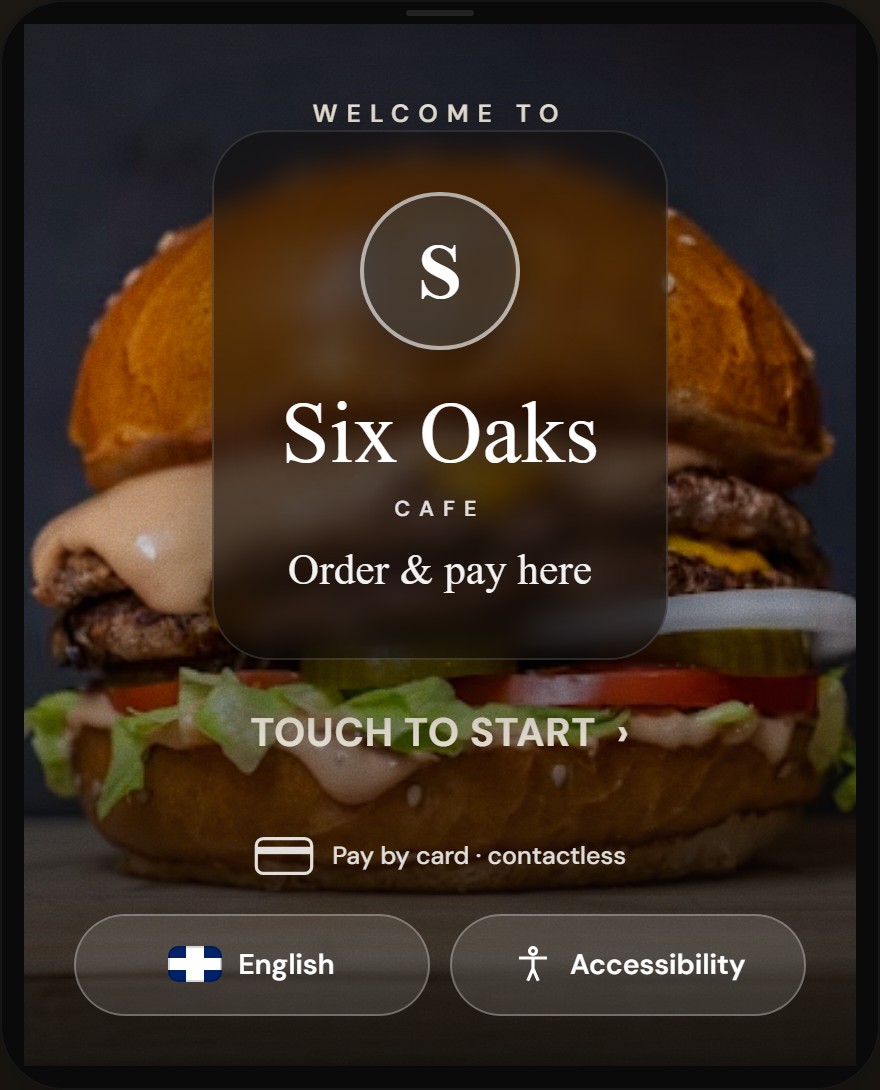
- The venue’s own brand mark on a frosted plate, so it stays legible over any photo in the loop.
- One instruction, one target. Touching anywhere starts a fresh order.
- Language and accessibility controls live on the idle screen, before the ordering flow begins.
Decision 02
Eat in or take away comes first, because VAT is not a detail
In the UK, eat-in and hot food carry 20% VAT while many cold takeaway items are zero-rated, so the same sandwich can legitimately cost less to take away. That means the eat-in or take-away choice changes every price on every following screen. It has to come first, before a single item is browsed, or the kiosk shows prices it cannot stand behind.
The review pushed this further in two ways. First, the VAT note was rewritten in plain English after testers read the legal phrasing as "your total can change", which is alarming on a payment device. Second, the step is conditional: it only appears when a venue actually operates both modes. A florist or a retail shop never sees it, and a single-mode cafe skips straight to the menu.
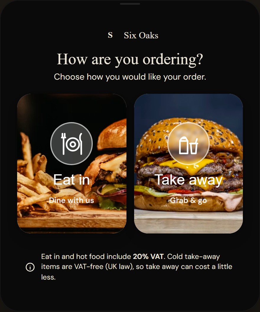
- A place setting reads as dine-in; each glyph appears with a visible text label, never alone.
- The takeaway bag and cup iconography repeats later in the header chip, so the symbol is learned once.
- The VAT explanation in customer words: take away can cost a little less, and here is why.
Decision 03
Browsing is built for arm’s length, not for a thumb
A standing customer at a portrait touchscreen is not a phone user. The browse screen uses large category chips, a grid of product cards with the photo contained on top and the name and price on a solid caption panel below. We tried text overlaid on photographs first; it cannot guarantee readable contrast over arbitrary food imagery, so it was rejected, and the kiosks that test best in the wild caption below the image too.
Interaction follows one rule with no third case: a product with zero options gets a one-tap quick add straight from its card; any product with options opens a detail dialog. An earlier mockup put quantity steppers directly on the grid; they rendered at roughly 35-40px, below our own 64px touch-target minimum, and made accidental adds easy while scrolling. They were removed. Dietary badges sit on every card because allergen and dietary information must be available before purchase, not buried behind a tap.
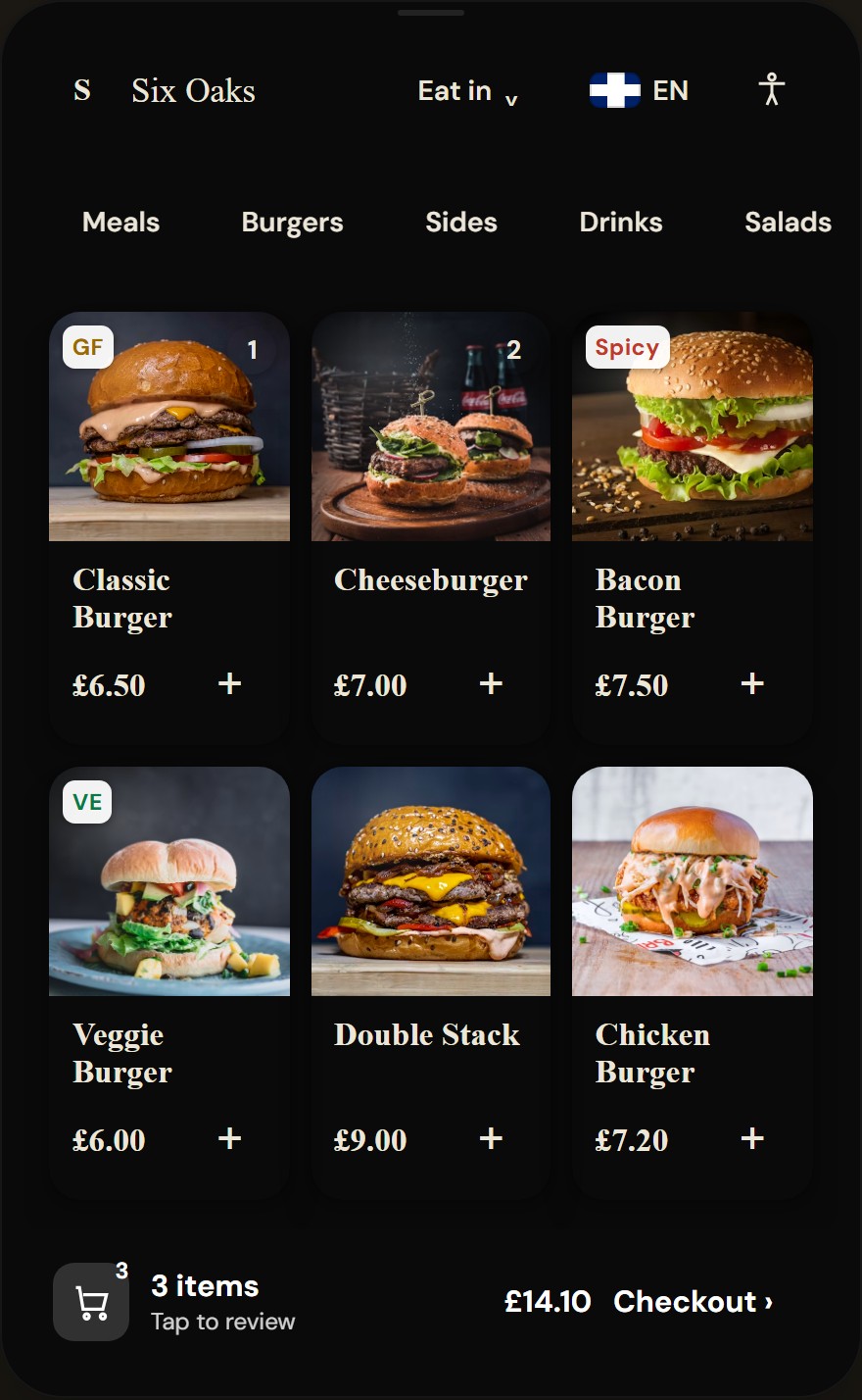
- Category chips sized for a standing reach; menus past about seven categories switch to an image side rail.
- Dietary badges (GF, VE, Spicy) on the card itself, visible before anything is added.
- Option-free items take a one-tap quick add; anything with choices opens the detail dialog instead.
- The persistent order bar: count, running total and the way into review, on screen at all times.
Decision 04
When the menu outgrows a chip row, categories move to the side
A horizontal chip row works while there are only a handful of categories. Past about seven it has to scroll, and a scrolling control at arm’s length on a portrait screen is exactly the fiddly interaction a kiosk should avoid: the customer has to swipe sideways just to discover what is on offer. So beyond that threshold the category rail becomes a vertical column down the side, an image tile and label per category, and the product grid reflows to two columns. The whole range stays in view; nothing hides behind a swipe.
The side rail is image-led for the same reason the product cards are: a photo of a bouquet or a burger is recognised faster than a word is read, especially by someone scanning from a step back. It is a per-venue option, not an automatic flip, because a six-category cafe reads best as chips while a thirty-line food hall reads best as a side rail. The venue picks the layout that matches the size of its menu.
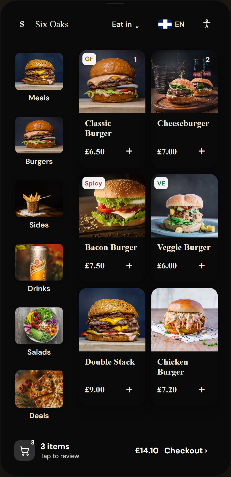
- Each category is an image tile plus a label, recognised at a glance from a step back.
- The whole category list stays visible down the side, so nothing is hidden behind a sideways swipe.
- The product grid reflows to two columns to make room, keeping the photographs large.
Decision 05
The item dialog makes required choices impossible to miss
Options are where kiosk orders go wrong: a missed "choose your bun" either blocks the kitchen or surprises the customer. Required option groups carry an accent border and an explicit "Required" count; optional groups do not. Radio buttons and checkboxes are chosen by the rule of the group, not by styling whim, and the add button refuses to proceed until every required group is satisfied, highlighting and scrolling to whatever was missed.
The dialog also carries the allergen line and a route to full allergen information before anything is added, and a small note explains that each add is a separate line, so two burgers with different options never silently merge. The sticky footer shows the live price for the configured item, not the base price, so the number on the button is always the number that will appear in the basket.
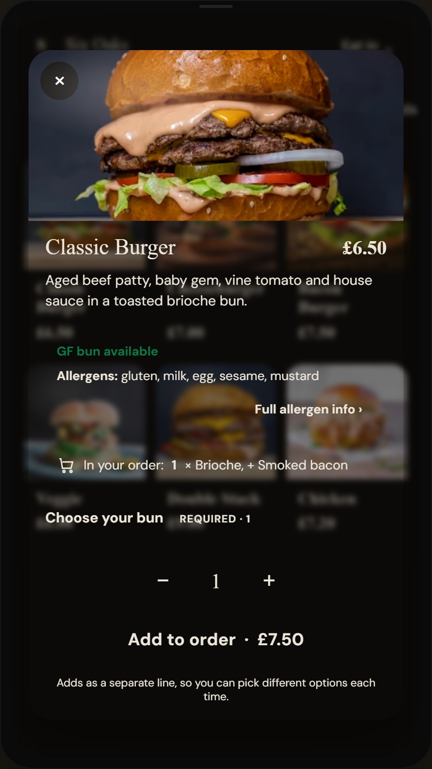
- Allergens and a full-information link sit ahead of the choices, satisfying pre-purchase allergen duties.
- Required groups carry the badge and count; the add button will not pass until they are satisfied.
- The sticky add button quotes the configured price, including the options just picked.
Decision 06
The review screen tells the truth, even when it is awkward
The adversarial review caught the first totals block claiming a subtotal equal to the total with a "VAT (incl.)" row between them, which reads as VAT about to be added on. It was respecified: every line is the unit price times quantity including options, and the total states the VAT it already includes. Nothing on this screen implies a surprise at payment.
The harder honesty problem is stock. A kiosk order can outlive an item: something sells out between adding it and checking out. The easy implementation fails the whole order; the honest one removes the line visibly, says so in a banner, updates the total and lets the customer carry on. Each line keeps its photo, its option summary and an edit route, because recognising what you ordered is faster than reading it.
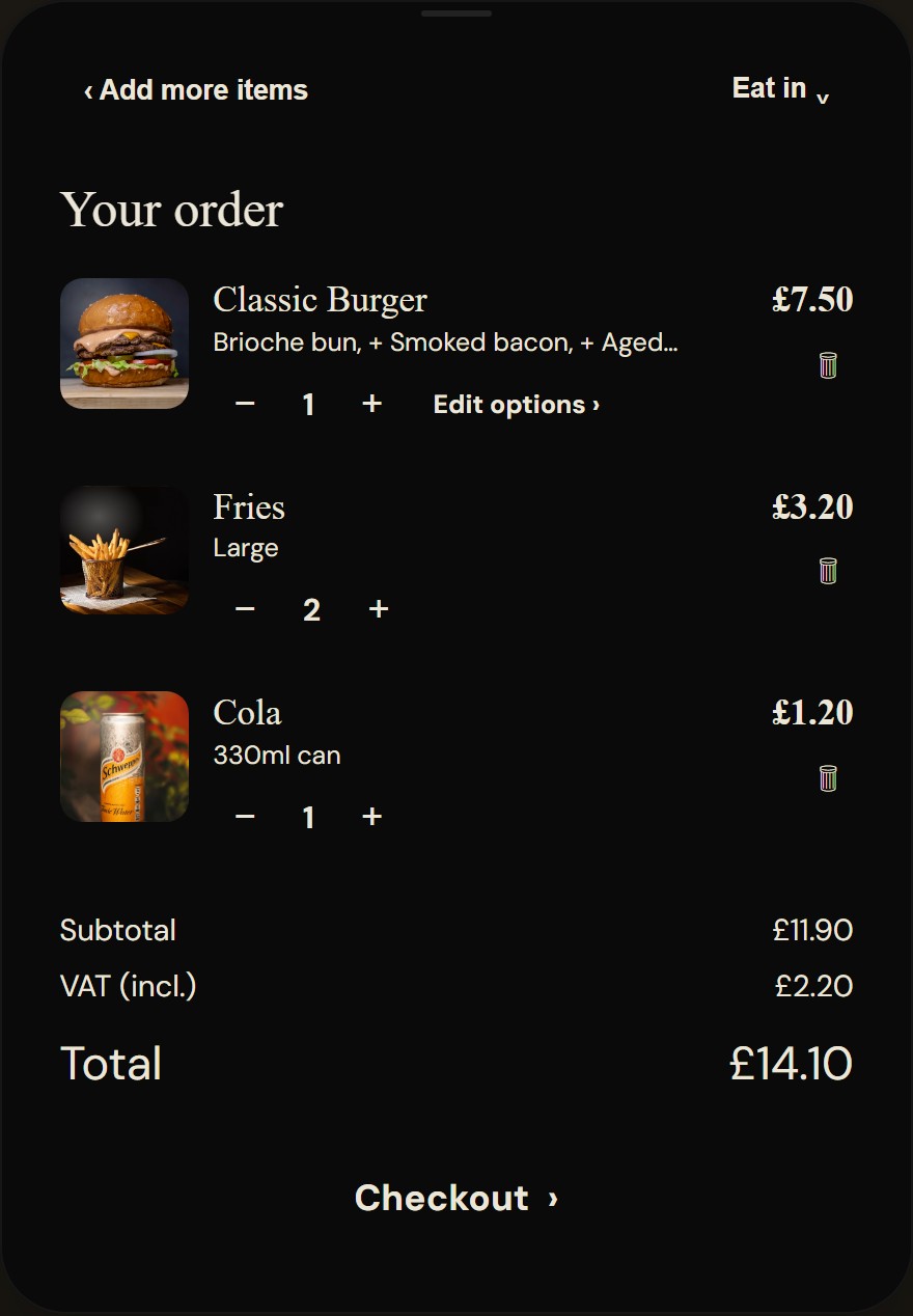
- Each line shows its options summary and an edit route back into the dialog, not a delete-and-redo.
- VAT is stated as already included in the total, never as a row that looks like it is about to be added.
- Checkout is labelled as checkout. The word "pay" is reserved for the card reader screen itself.
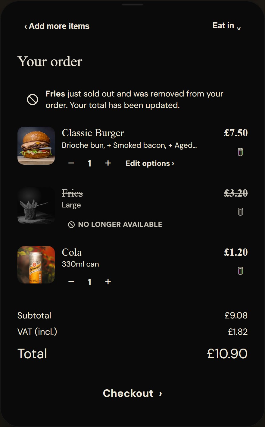
- A plain banner: what sold out, that it was removed, and that the total is already updated.
- The dead line stays visible, greyed and struck through, so the customer sees what changed and why.
- The recalculated total. The customer keeps their order; only the unavailable line is gone.
Decision 07
A name, not a number, and the order is held before the money moves
Just before payment the kiosk asks one question: who is this order for? A name humanises collection ("Sarah!" beats "A47!" shouted across a room) and it travels to the kitchen ticket. The same screen carries a deliberately quiet allergy block: a toggle plus structured allergen chips, never a free-text box. Free text on an unattended screen is a liability the kitchen cannot safely act on; a fixed set of allergens is something it can.
Then the part nobody sees, which the review proved was the most important design decision on the kiosk: sequencing. The order is created and held first. The kiosk validates the basket and opens the order on the till before any money moves, so the order always exists before it is paid for. Only once it is held does the kiosk take payment and the order get processed: fired to the kitchen and settled. If the order cannot be created, nothing is charged and the customer is simply asked to order at the counter. The confirmation screen and printed receipt carry a collection reference with a barcode staff can scan at the till, so even the failure modes end with a human who can fix it.
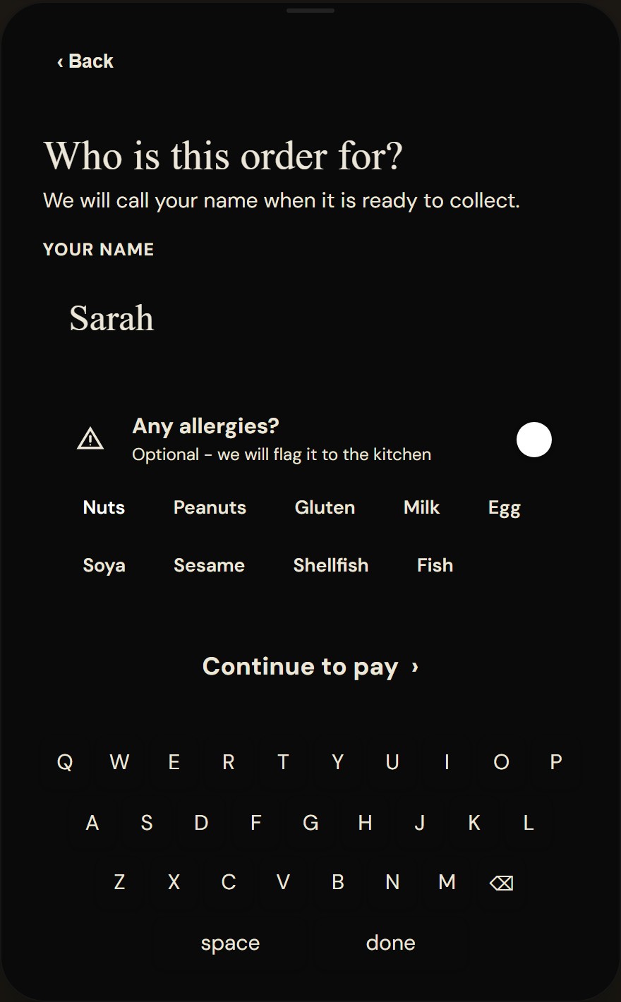
- The name calls the order at collection and prints on the kitchen ticket.
- Allergies are structured chips behind a toggle: skippable, discreet, and safe for a kitchen to act on. No free text.
- The keyboard sits at the bottom of the screen, inside comfortable standing reach.
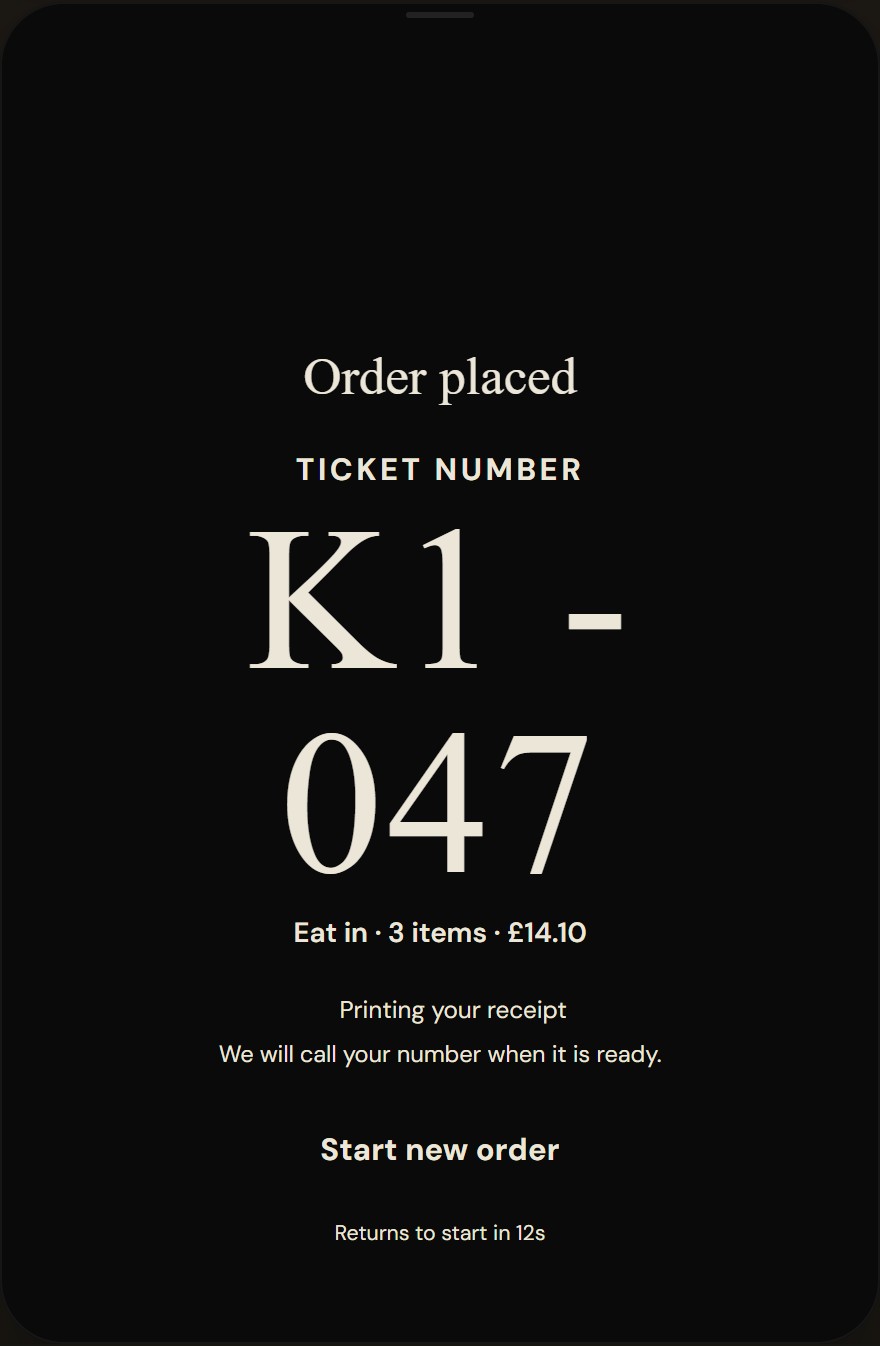
- The collection reference, printed and on screen, stays valid for till recall even after payment settles.
- The screen resets itself for the next customer after a short countdown.
Decision 08
One menu system, any brand on the front of it
The kiosk is not the phone menu enlarged. The phone experience is intimate and editorial; a standing self-checkout needs to be bold, glanceable and fast. So the kiosk defines its own layout language, but consumes the same per-venue theme: colours, logo and a preset that retypes and recolours every screen. A cafe, a bar and a retail shop run the same software and look like three different products.
Most presets restyle the same layout. The dark late-night preset goes further and changes the design language itself: immersive dark chrome, a warm glow, different typography and image-led cards. It exists as proof that a preset can carry a genuinely different personality, not just a different accent colour, without forking a single screen of the flow underneath.
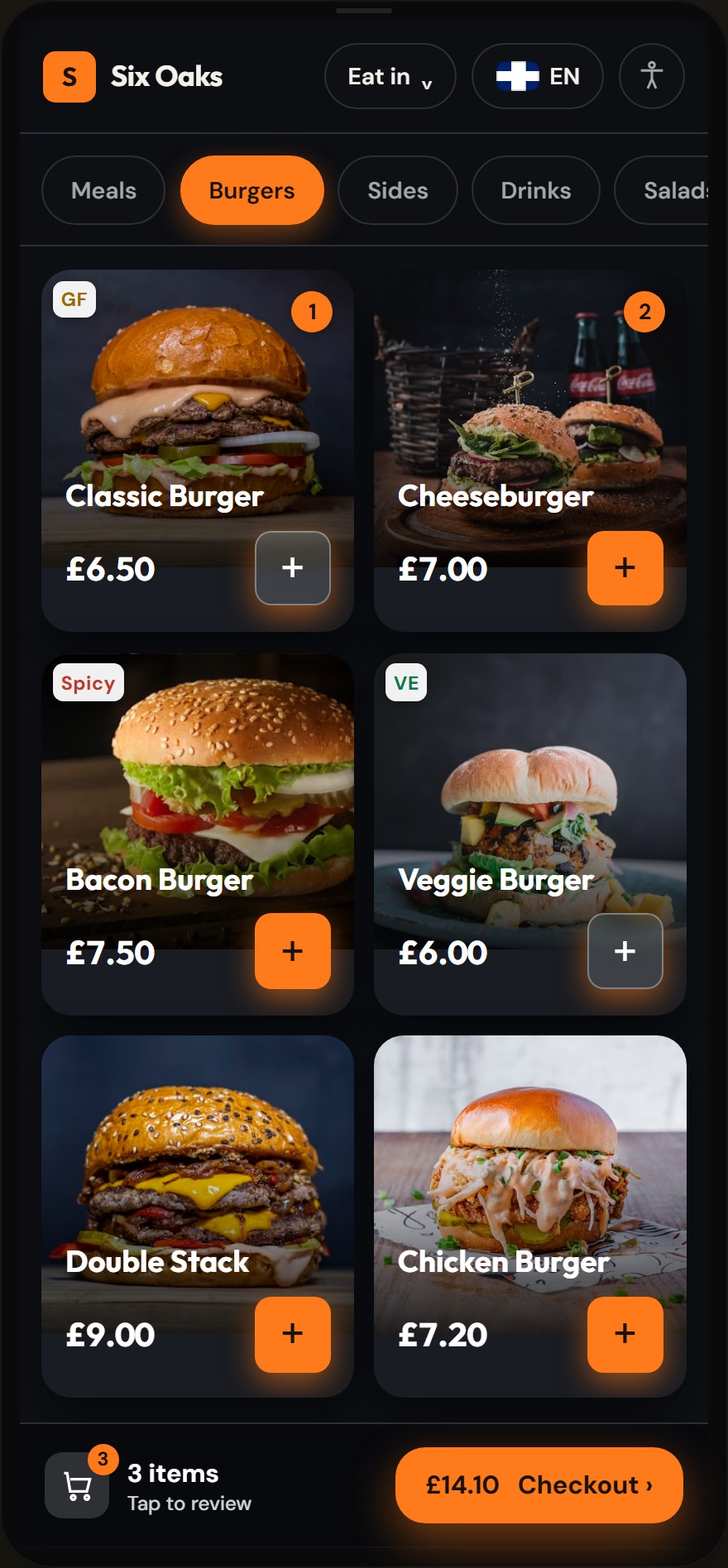
- Venue brand mark and accent colour come from the venue’s theme settings, not a redesign.
- The category rail, cart badges and order bar are the same components as the light preset.
- The late-night preset goes image-led: larger, glowing cards in immersive dark chrome.
Decision 09
Beyond food: the same kiosk builds a bouquet
The hardest test of "any small venue" is a venue that does not sell dishes. For shops whose product is composed rather than picked, we designed a reusable bundle-builder module and proved it on the most demanding case we could find: a florist. Choose a size, pick stems against a minimum and maximum, watch the bouquet gather in a live tray, wrap it, pay.
A bouquet is one order line that expands into its component stems, priced as their sum. Because that is configuration rather than code, the same engine serves a hamper shop, a pick-and-mix counter or a build-a-box retailer. It also earned its own visual language, warm paper and botanical greens, as a second proof that presets can carry a trade’s character, not just a colour.
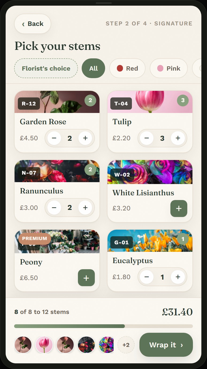
- A visible step indicator: composing a product needs a sense of place that a menu does not.
- The count meter holds the build between the size’s minimum and maximum stems.
- Every picked stem appears in the gather tray, so the bouquet is watchable as it grows.
Where it landed
Try the result, live on this site
The kiosk on the VenueDeck home page is not a video or a mock: it is the real ordering flow, re-themed live as you switch business types, with honest running totals. The design above is what you are touching.
In a venue, the same software runs full-screen on modern Android self-service units with a built-in receipt printer and an integrated card reader, synced with the till, fed by a CSV catalogue, or fully standalone.
See the live kiosk demo