Design case study
Designing VenueDeck table ordering
Scan the QR on the table, order from your phone, and the order lands on the till. Simple to use, and deceptively fussy to get right: get the money pipeline wrong and you end up with food and no bill, or a bill and no food. This is how table ordering was designed and why each screen behaves the way it does.
VenueDeck design team · Spring 2026 · Table ordering
The problem
At table service, the till is a queue with a wage attached
Sit down at a busy cafe or pub and you wait twice: once to catch someone to take the order, and again to catch them to pay. Both ends run through one till and one member of staff, who is also carrying plates and answering questions. Tables turn slower than they could, and the people most likely to spend more, the ones ready to order another round, are the ones left waiting.
Table ordering is the obvious fix: a QR on the table, the menu on the guest's own phone, the order straight to the kitchen. But the same shortcut is where small venues get burned. Bolt a phone ordering layer onto a till it does not really understand and you get orders that never reach the kitchen, prices that drift from the menu, and the nightmare case: a guest charged for food the kitchen never made.
So the brief was not "build a menu with a basket". It was: design the whole order lifecycle for a venue with no developer and no appetite for risk. It had to work whether the menu is synced live from the till, imported from a CSV, or run standalone, and it had to be safe to switch on the morning of a service.
What we investigated
We wrote down who holds the money before we drew a single screen
The first thing on the wall was not a layout. It was the order lifecycle as a state machine: who creates the order, the moment it fires to the kitchen, who holds the money, and what happens at every failure in between. Self-checkout had already taught us the rule the hard way during its adversarial review: the order must exist before any money moves. Table ordering inherits that rule and adds a twist, because at a sit-down table nobody pays up front at all.
That reframed the whole design. A table order is created and held first, the kitchen fires from a deliberate decision rather than a card swipe, and the bill stays open on the table to be settled at the till the way it always has been. Nothing the guest taps on their phone is trusted with money or stock: the till re-prices every basket from the live menu and decides what is really available. The phone proposes; the till disposes.
The smaller decisions fell out of that spine. Choices had to be unambiguous so the kitchen ticket is never a guess. The table had to be bound to the order without making takeaway jump through a hoop it does not need. And the guest had to be able to watch honest status rather than refresh and hope. Each of those is a screen below, paired with the reason it looks the way it does.
Decision 01
The QR is the table, so the menu opens ready to order
A per-table QR carries the table with it. Scanning the code on table two opens that table's menu already in eat-in mode, so the prices are correct from the first glance and there is nothing to choose before browsing. The phone is the guest's own, held at reading distance, so this is an intimate, editorial layout: image-led product cards, live categories, and a tap to open anything with choices.
It is the same menu the customer would use for collection or delivery, re-themed to the venue's brand, not a stripped-down table-only variant to maintain. Eat-in and takeaway pricing still follow the service type, because hot food and dine-in carry VAT that cold takeaway often does not, so the figure the guest sees is the figure they will be charged.
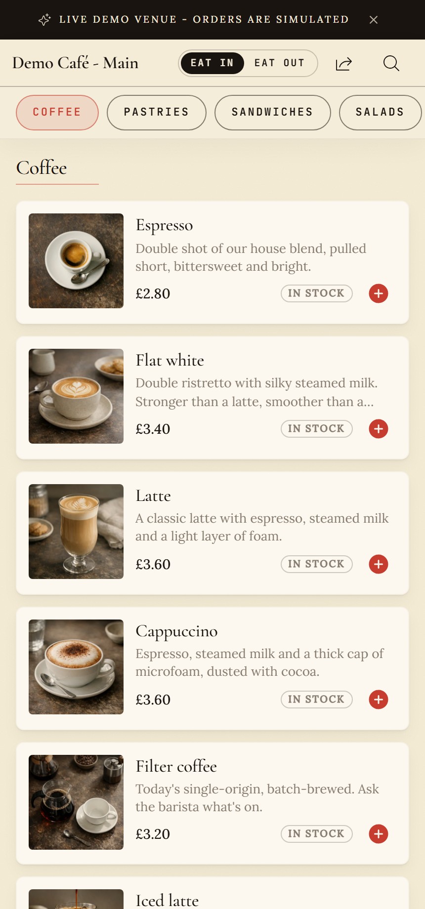
- The QR opens the table already in eat-in mode, so every price on the screen is the one that will be charged.
- Image-led cards: the photo does the selling, the name and price sit on a solid panel that stays readable.
- A simple item adds in one tap; anything with choices opens the item dialog instead.
Decision 02
Choices and notes live in the dialog, so the kitchen ticket is never a guess
Options are where phone orders go wrong: a missed "which milk" either stalls the pass or surprises the guest. So any product with choices opens a dialog that makes the rules obvious. Required groups are labelled "Required" with the number to pick and will not let the item be added until they are answered; optional groups say so. Allergen and dietary information sits above the choices, before anything is added, not buried behind another tap.
Each line carries its own note field for the small human requests ("oat milk, extra hot") and the price on the add button updates as options are chosen, so the number on the button is the number that reaches the basket. Two of the same drink with different options stay as two honest lines rather than silently merging, because the kitchen reads lines, not totals.
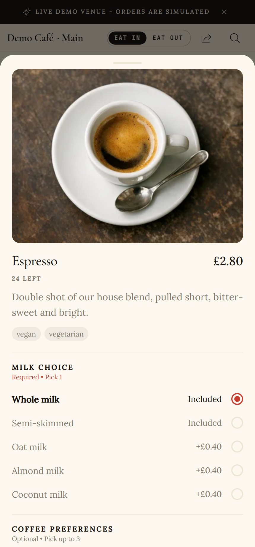
- Dietary badges sit ahead of the choices, available before the item is added rather than after.
- Required groups carry the label and the count, and the add button will not pass until they are answered.
- Optional groups are marked optional, so nothing reads as compulsory that is not.
Decision 03
The cart is a companion, and you pick the table at checkout
The cart is never a separate page. It rises as a sheet over the menu (and collapses to a slim panel on larger screens), so adding a round never throws the guest out of browsing. Everything needed to send the order lives in that one sheet: the lines, a per-line edit, the running total, and the table.
Which table is asked here, at checkout, and only when the venue needs it. A per-table QR already knows the table, so this picker is the fallback for a single shared QR or a venue that prefers to confirm. It is gated by how the venue runs: required, optional or off. Eat-in always reaches the right table; takeaway is never blocked by a question that does not apply to it. The tables themselves come from the till, grouped by area, so the list a guest sees matches the floor the staff know.
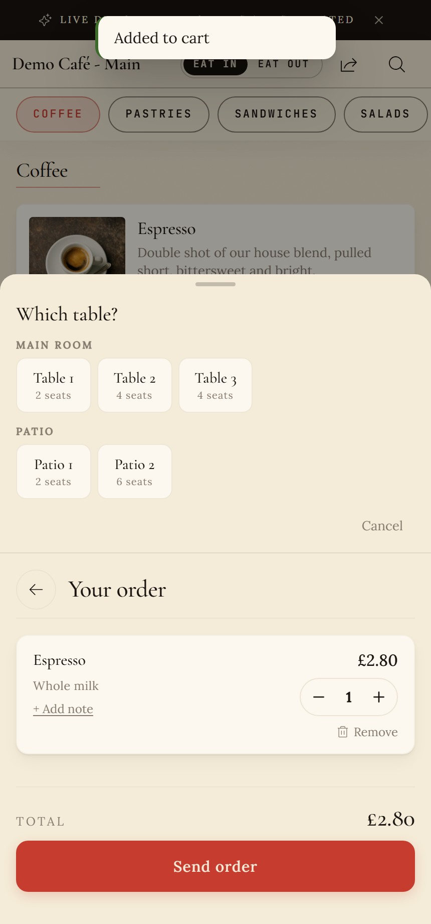
- Tables come from the till, grouped by area with seat counts, so the choice matches the real floor.
- The sheet rises over the menu rather than replacing it, so browsing is never interrupted.
- Send order sits at the bottom within thumb reach; the table is bound to the order as it is sent.
Decision 04
The order is created and held before anything fires, and the bill stays open
This is the decision that matters most and that nobody sees. When the guest taps send, the order is created and held first: validated against the live menu and opened on the till before it is allowed to cook. Only then does it fire to the kitchen, either automatically or after a staff approval, depending on how the venue has set it up. If the order cannot be created, nothing happens silently; the guest is told and can order the old way. The order always exists before it is acted on.
Because this is table service, no card is taken on the phone. The order opens a bill on the table that is settled at the till at the end, exactly as it is today, so the design slots into how the floor already works instead of forcing a new payment habit on the guest. Quiet guard rails keep it safe: the till re-prices every basket from the menu so a tampered phone cannot set its own price, and caps on order value and frequency stop a single device spamming the kitchen.
Decision 05
Honest status the guest can watch, not a refresh-and-hope
Once the order is in, the guest gets a live status they can leave open on the table: a plain track from waiter to kitchen to done, updated in real time with a polling fallback for flaky table Wi-Fi. It is deliberately calm and truthful; it never claims a step that has not happened.
The wording is the venue's to set, because "with the kitchen" means something different in a wine bar and a burger joint. The screenshot here is the live demo's simulated order, which is why it says so plainly: in a real venue the same track follows the order through the kitchen, and the bill stays open until it is settled at the till.
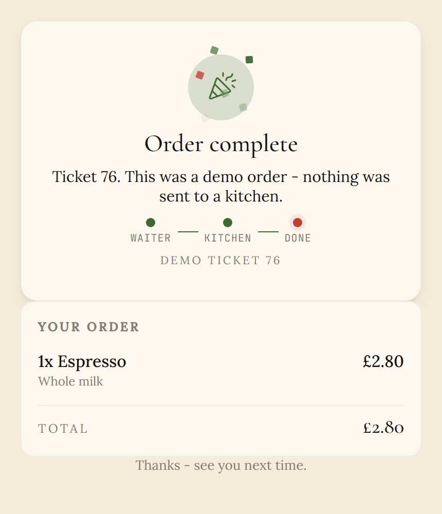
- A plain three-step track, updated in real time with a polling fallback so a weak table signal still shows progress.
- Honest by default: the demo states that this was a simulated order with nothing sent to a kitchen.
Decision 06
A venue can switch it on without a developer
Table ordering is set up from one tab in the admin, in plain language. The enable toggle is deliberately locked behind a short pre-flight checklist, so a venue cannot accidentally go live with an unpublished menu, no printers assigned, nobody set to confirm orders, or no active tables. It refuses to turn on until the order would actually reach a kitchen.
Everything else on the tab is a real operational lever: approve every order before the kitchen fires, or auto-fire trusted tables; the value and frequency caps; the exact words the guest is shown at each step; and the tables, synced from the till and grouped by area, each with its own QR. A live preview on the right shows the guest's phone updating as the settings change, so the person setting it up can see what they are shipping.
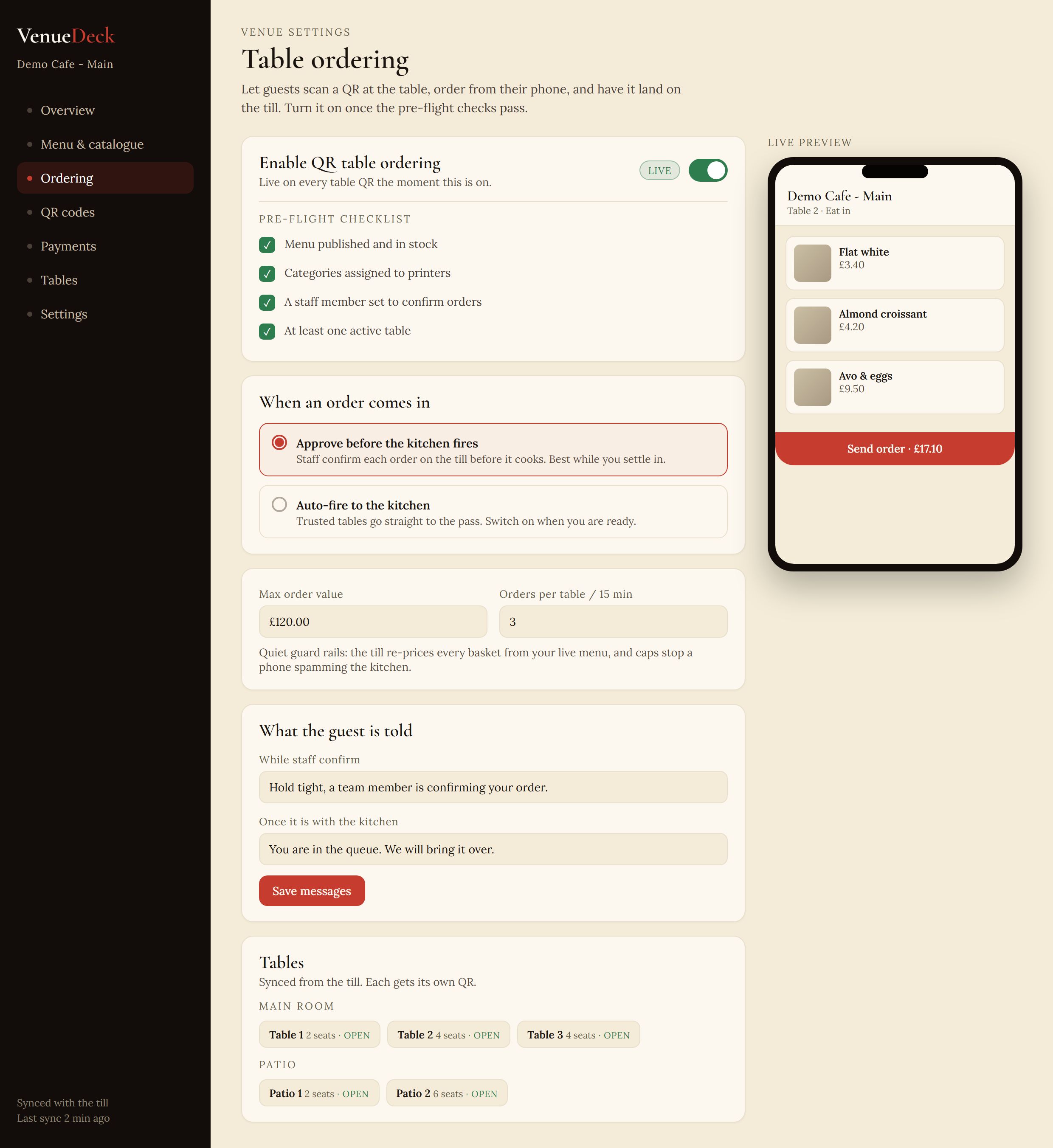
- The enable toggle is gated by the pre-flight checklist below, so a venue cannot go live half-configured.
- Approve before the kitchen fires, or auto-fire trusted tables: the safe default first, the fast one when ready.
- Quiet guard rails as settings: a max order value and a per-table rate limit.
- A live preview of the guest's phone, so setup is something you can see, not guess.
Decision 07
The board the kitchen will work from, designed honestly ahead of build
Held orders need somewhere to be worked. The designed front-of-house board collects every order in one place: awaiting approval on the left, in the kitchen in the middle, ready with the bill still open on the right. Staff approve an order to fire it, mark it ready when it leaves the pass, and the bill stays on the table to settle at the till. It is built around the same held-order events the rest of the pipeline already emits.
We are showing it as a design, not a shipped screen, because that is the truth: today staff confirm orders on the till through the online-order utility, and the dedicated board is the next step rather than a live feature. Designing it now, against events that already exist, is how we keep the build honest and the pipeline coherent before a single line of the board ships.
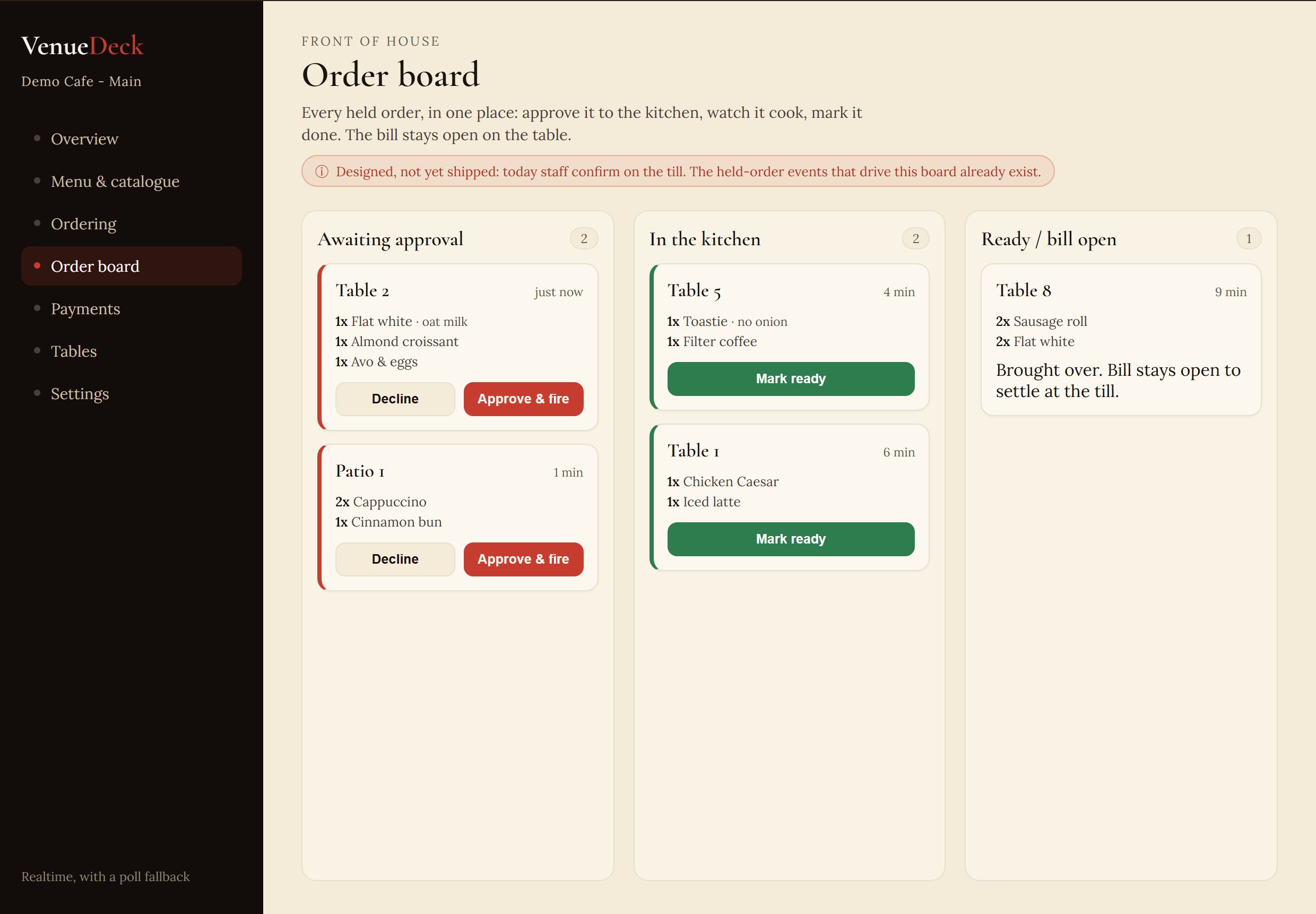
- Stated up front: this is a designed screen, not yet shipped. Today confirmation happens on the till.
- Held orders wait for approval; one tap fires them to the kitchen, or declines them.
- Ready orders keep the bill open on the table, to settle at the till as usual.
Where it landed
Order from a table, live on the demo
The customer screens above are real: open the demo menu, choose eat-in, add something, pick a table and send. It runs the genuine held-order flow, simulated end to end so nothing reaches a real kitchen, with the same status track a guest would watch.
In a venue, the same flow is synced with the till, fed by a CSV catalogue, or run standalone, and the bill stays open on the table to settle at the till.
Try the live menu demo